Sunday, April 27, 2014

Project Six: Animation

Final Animation:


This is my final animation video I have made for class. At first, I was unsure what I was going to make a video on. I thought I should make one for my fictional company, Jessica's Jams, but thought I would do something a little different. A commercial came to mind. I absolutely love traveling and exploring new places, so what better way than to choose a commercial for a resort on a private island?! I put together a small video clip for an (unnamed) resort (with many destinations to choose from) as my video. I paired the images with a tropical music clip, which is everything I expect to see when someone is advertising for their hotel on TV. Hope you enjoy :)

Saturday, April 5, 2014

Project Five: Lyrical Collage

Final:

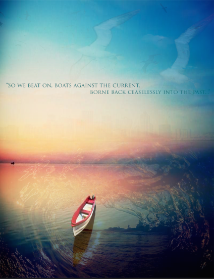
This is my final image that I created for this project. At first, I was really worried about creating one image using five or more existing images, because each photo is so entirely different. In the end, I am pretty happy and satisfied with my final! (The original photos I used are posted below, which are ALL from Google.) I chose the quote, "So we beat on, boats against the current, borne back ceaselessly into the past". This quote is from the Great Gatsby, which is my favorite novel by F. Scott Fitzgerald and one of my favorite movies. I think it was so beautifully written, and I find myself constantly reciting lines and quotes from the book/movie. Gatsby said this quote, and I believe it sounds beautiful. So, I started with my background image, which was simply a picture of a lake with a boat in it. For my second image, I chose a current (denoted from the quote as well as the boat) and placed it on top of my background image. For my third image, I chose a flock of seagulls in the sky. I had difficulty not placing the photo, but merging it with the existing photos so it looked like they just flowed. My fourth image, (which is barely visible, but intended to be so) is the New York City skyline. I put it in the background behind the boat. And my fifth and final image, I chose to duplicate the seagull picture and use again, because before it, the sky looked a bit bare. I was debating whether or not to type the quote out, but decided to because I think it really completes the picture. 

Here are the original photos I used, in order!


Monday, March 31, 2014

Assignment Five: Custom Graphic

Final:


Working with the brush tool was quite interesting, and fun! It was nice to have an assignment you could just play around with and make something out of one image, duplicating it, using different colors to make one final image. Mine kind of reminds me of a water color painting, between the colors and the flow of the crayons in the direction they are facing. 

Here is the original crayon I used for this assignment.

Original: 


Sunday, March 30, 2014

Project Four: Magazine Cover

Final Magazine Cover:


I absolutely loved working on this project! I had so much fun working with Photoshop for the magazine cover. At this point, I am a little more familiar with the tools Photoshop includes and it was fun to work with. My magazine name; "Reader's ByJess" was inspired by the real magazine "Reader's Digest". If you have ever seen or read Reader's Digest, you will know it is more of an everyday life type of magazine, everything from family, cooking, and home upgrades! I loved the name, and gave it my own twist. However, the 'information' my magazine has on the cover is a total "trash mag", like Star, US Weekly, or People magazine, which contains all the newest Hollywood gossip. 

The pictures I used below are the originals, before using liquify, blur, and pucker tools to distort the photos. Hope you enjoy! :-)

Original(s):


Ryan, before I distorted his face and gave him all that Hollywood plastic surgery. 


Pre-Lip Injections.


Pre-Anorexia! 

Monday, March 24, 2014

Assignment Four: Self Insertion

Final: 

This is my final Self Insertion image. I enjoyed working on this assignment and learning more and more about Photoshop while doing it! My original photo, which is posted below...was taken at the beach months ago. I thought it would be cool to take a totally different take on a background image, and that is why I chose a lava pool! I made my legs more of a red tone to go along with the heat of this image. 

Original:

Thursday, March 6, 2014

Project Three: Vector Illustration

Illustration:


This is the vector illustration I came up with. The photo below is the one I copied for this project. Yes, it was a car "selfie". We are all guilty at one time or another. I think the photos resemble each other very much except a few slight details. I tried to the best of my ability, making them as comparable as possible. One of my favorite parts is my glasses. I used the gradient tool in Illustrator to fill the glasses to resemble my glasses in my original picture. 

Original:


Sunday, March 2, 2014

Assignment Three: Exquisite Corpse

Hmm...what to say about this? Not really sure. I'm sure it will scare you because it sure scares me. This was a really hard project for me. I tried my best to emulate the sketches we drew in class, however, had a ton of trouble with the bottom half of the corpse. I didn't have trouble actually tracing the figure, it actually turned out quite well, however, when it came time to fill with colors- illustrator was giving me tons of problems. The layers got messed up, which ultimately led to an even more messed up looking corpse.